Designing a brand that celebrates neurodiversity
Graphic designer Thomas Barnett gives us a behind-the-scenes look at how the Neurodiverse Connection brand was designed, and explores some of the intersections of neurodiversity and design-thinking.
To live as a neurodivergent individual in a world designed for and by the neurotypical majority means becoming accustomed to questioning one’s own interpretation of things. It means habitually casting off the secure assumption that ‘others see things the same way as I do’. Neurodivergent individuals are often minutely aware of the subjectivity of their gaze. They are also more attuned to the subtle gradations of meaning in details that may seem trivial to the neurotypical eye. Unfortunately, these mental specialisations are all too often learned from difficult experiences of conflict with the neurotypical world.
However, in the design process, these ways of thinking are essential to create work that transcends subjective preference and instead speaks powerfully and empathetically to its intended audience. They are the qualities that designers often bemoan the lack of in the briefs and feedback we receive from a (neuro)typical client. The neurodivergent mind can present a unique combination of detail-oriented sensitivity and self-aware subjectivity that is uncannily similar to the mindset that is a prerequisite for creating meaningful design work—particularly when designing branding.
In my work with the team at Neurodiverse Connection, I have been blessed with clients whose positivity, creativity and neurodivergent specialisms have allowed for a frictionless and highly creative design process, leading to the joyful NdC brand as you see it today. The project has been a success for many reasons, but one of them has undeniably been the productive symbiosis between ‘design-thinking’ and neurodivergent ways of thinking and working. For this reason (among myriad others) I would encourage all fellow design professionals to actively seek out work with neurodivergent clients, to explore how our definition of the design process can be expanded and enriched.
Whilst the intersection of design-thinking and neurodivergent ways of thinking has been one factor in the success of this project, another has undoubtedly been the uncompromisingly positive vision for the NdC espoused by founder Jill Corbyn and the rest of the team. Their tireless and radical optimism has opened my eyes to how branding and graphic design can (and should) strive to be better, bolder and braver by not just accommodating, but actively celebrating neurodiversity.
This article shares highlights from our work together, and aims to shine a light on the process of creating a brand from scratch.
Part 01
Listening & learning
We began the project as I always do: with a series of conversations. I was aware that I was an outsider coming into a close-knit team with extensive shared knowledge and experience—both personal and professional. Before proposing any ideas, I needed to absorb as much information as possible about the purpose, vision and values of the organisation, and the work that Jill and their team undertake.
As a neurodivergent but non-autistic person, I also hoped to be able to explore Jill and Chris’s personal experience of autism, as well as their professional and academic knowledge and experience. I was granted the privilege of some frank, illuminating conversations that produced many valuable insights. Some of these insights went on to become key tenets of the brand design, such as the idea of NdC’s work “providing a translation service between people of all neurotypes”.


ABOVE Some key phrases and ideas that emerged from my initial conversations with Jill Corbyn and Chris Memmott.
So, with this in mind we began to consider some of the broad visual requirements of the brand. We knew that this needed to feel like a space for celebration, not just inclusion. We knew that we wanted to emphasise neurodivergence as a positive culture, not a pathology. We knew that we wanted colour and vibrancy but needed to be particularly conscious of sensory overwhelm when speaking to a neurodivergent audience.
We also discussed the practical parameters of the project. The brand needed to express all of these ideas, but it also needed to be lean and easy to use. The brief was to create a visual system that could be used by non-designers and still yield beautiful, consistent results. The brand needed to be constructed as a library of assets that could be easily combined together to create striking visuals. The typography needed to be super-legible and the colour palette carefully considered to meet the highest standards of accessibility—not just for people of all neurotypes, but for those with visual impairments and other differences in ability.


Brand Guidelines From the outset of the project, we identified one of the key deliverables as being a set of comprehensive but concise brand guidelines that would allow the brand to be easily and confidently deployed, even without ongoing support of a design professional.
Part 02
Brand positioning
In addition to these conversations, I also prepared a questionnaire for the team to fill out, with the aim of ‘positioning’ the brand by defining various attributes. One of the questions aimed to distil the ‘personality’ of the brand, by asking participants to mark a point on a scale between pairs of descriptive words. Some of these pairs were straight-forward opposites, (such as ‘contemporary’ and ‘traditional’), while others aimed to delineate finer distinctions between more malleable qualities (such as ‘literal’ and ‘allusive’). See their aggregated answers below.

Brand Personality chart The purple line shows what traits and qualities the team felt the NdC brand personality should encompass.
So what is a ‘brand personality’? I will readily admit it sounds perilously like corporate jargon, but I believe that, used properly, it is a graphic designer’s secret weapon for establishing strong creative briefs for their brand design work, and it was a vital step in creating the NdC visual brand.
A brand can be conceptualised as six concentric circles. At the heart is the ‘purpose’; the reason that the business exists (other than making money). Then comes the ‘vision’, ‘mission’ and ‘values’ (each of which has a precise definition and application, but to elaborate on them in this article would risk turning it into an even lengthier monograph than it already is).
Finally, there is the aforementioned ‘brand personality’, which is where all of the previous ideas are forged and fused together into something that can be conceptualised and intuitively understood, rather than many paragraphs of dense corporate prose. The personality is when a brand is anthropomorphised, so that we feel we can relate to it as a person.

Brand Positioning diagram Devising a ‘Brand Personality’ helps formalise the vital interface between brand purpose, vision, mission and values and a visual brand design.
A brand personality thus serves as the vital interface between the formal elements of brand positioning, and the ‘visual brand’ (the logo, colours, illustrations etc). Thus, pinning down the personality serves to pin down an easily comprehensible creative brief for a graphic designer. By working on this element of Brand Positioning in collaboration with my clients, we are able to devise a creative brief that is truly meaningful, allowing visuals to be seamlessly connected to the ‘big ideas’ that animate the organisation. It keeps the creative brief focused and free from personal visual prejudices such as “yellow is my favourite colour”, or “I hate serif fonts”. Both of which are perfectly valid personal responses, but if a yellow, serif font-heavy brand turns out to be the strategically ideal channel through which to speak to your target audience, personal responses like these become blockers to success.
Part 03
Logo development
Logo Animation showing the three versions of the NdC logo: wordmark, abbreviated monogram and standalone symbol.
I never tire of telling clients that branding means more than just a logo. Whilst a logo is in many ways the face of an organisation, it needs to integrate seamlessly with every other element of the design, such as colour palette, typography choices and illustrative/graphic elements.
So with this in mind, it was only after having established some key practical and visual parameters that we began to draft logo designs. I identified the length of the name ‘Neurodiverse Connection’ as one of the challenges the logo needed to navigate. This was accommodated with specific typographic decisions, but also by creating a logo that separates into modules—a logo that works primarily as a full wordmark; secondarily as an abbreviated monogram; and tertiarily as a standalone symbol.
Some drafts showing the development of the logo are shown below.


Drafts showing development of the geometric symbol. The original idea (top left) shows the geometric increments of change between a circle and square (modulating through a decagon, octagon, and hexagon) to represent the idea that there translation is possible between neurodiverse and neurotypical minds, even if they may at first seem as opposite as circles and squares. This idea was then simplified so that just the hexagon was used as the mediating form, representing the work that NdC does to mediate and translate between neurodivergent and neurotypical individuals.


Alternate pathway of ideas using the circle/hexagon shapes and combining them with the idea of a bridge (referencing Jill’s conceptualisation of NdC as ‘a bridge between different neurotypes’). The bridge/people idea was executed in perspective, and as a two-dimensional linear pattern, with an almost mosaic-like design.


Part 04
Illustration inspiration*
*AKA the case for going on holiday in the middle of an important job
A key challenge for the brand was how to represent people of different neurotypes without relying solely on stock photography, with its tired cliches and inbuilt prejudices. We decided to explore illustrations as the primary brand visuals. We experimented with a combination of abstract and pictorial elements, building a graphic language that allowed us to express complex ideas in an engaging and personable way.
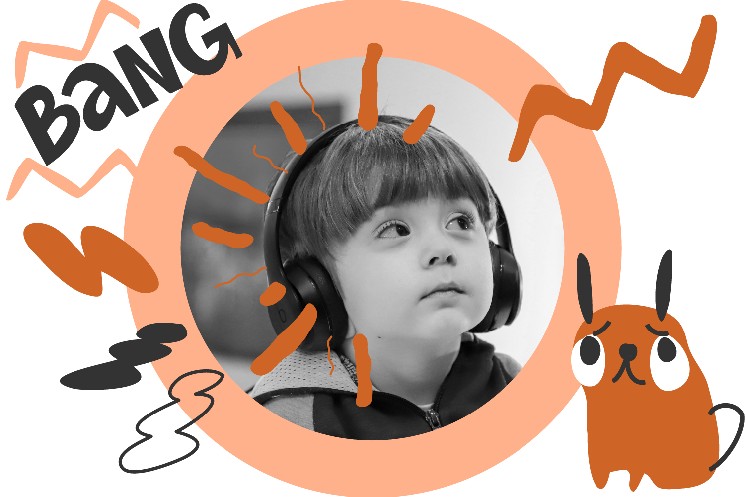
The first breakthrough was an email from founder Jill, in which they asked “what if all the imagery on the website was just photos of Bat?” (Bat being their beloved spaniel). Although initially posed as a half-joke, when we considered the proposition seriously we realised they had hit upon a radical and inspired solution: to sidestep the complex and entangled issues of neurodiverse and disabled representation in photography, what if we created a cast of canine mascots to stand in for people? We expanded the idea to include a veritable menagerie of cats, birds, leopards and more.
The second breakthrough came when I took a trip to Paris, in September 2022. I noticed some striking street art on the Faubourg Saint Germain. The playful, semi-abstract forms were sprayed onto the side of a small Mexican restaurant. The style was simple but punchy, balancing playfulness and humour with not being too abstract and allusive.


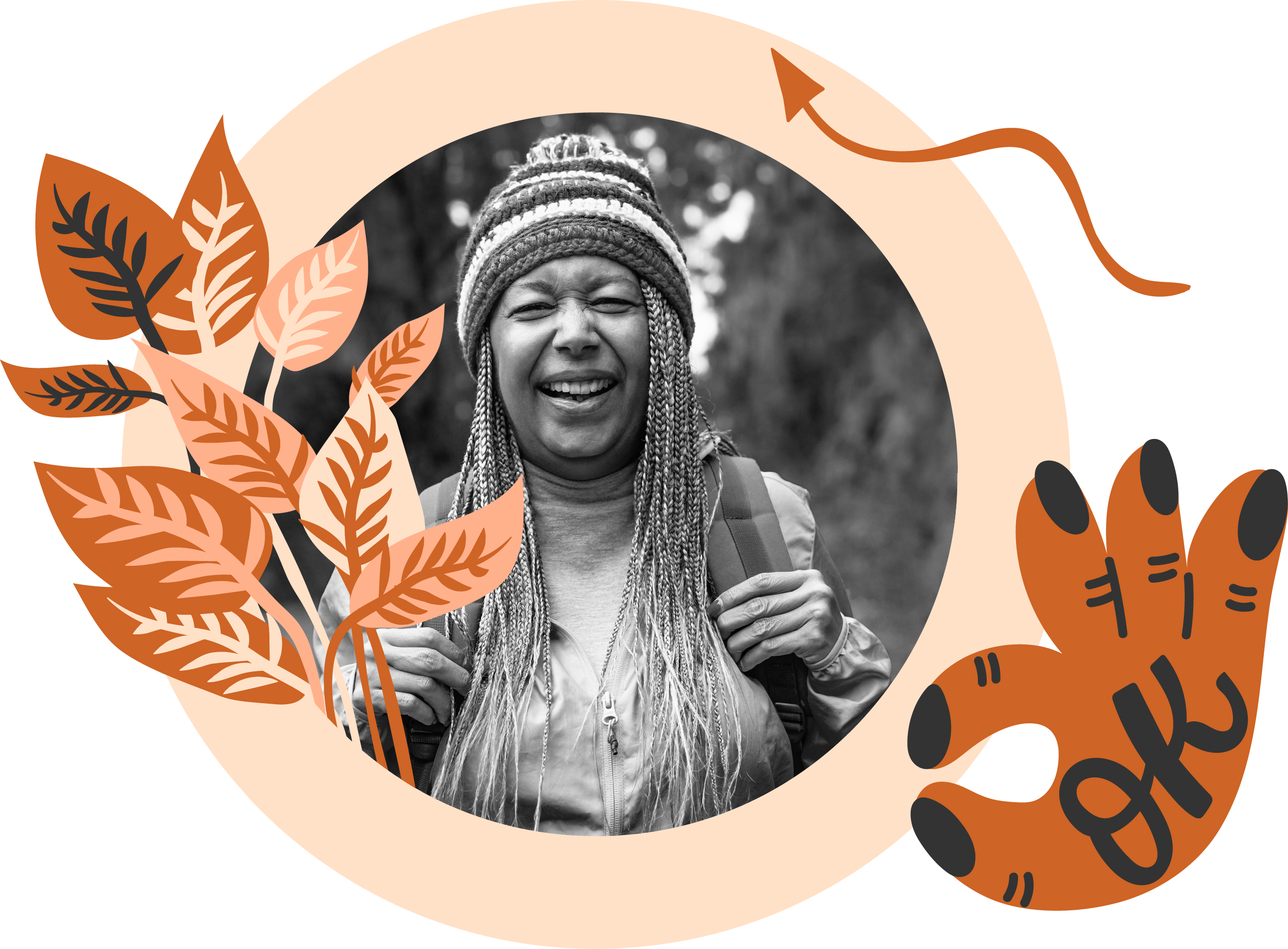
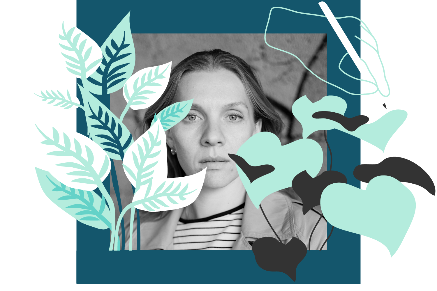
Using this as the seed of an idea, I began to play around with some doodles in simple, irregular shapes and a flattened 2D perspective. Integrating the trio of shapes from the logo allowed us to combine disparate illustrated elements with some consistency. Using the three shapes as frames for photography was the final piece of the puzzle, allowing us to create hybrid illustration/photographs that expressed complex ideas around neurodiversity, community, sensory experience, medical and social care and the wider world.


Part 05
Putting it all together
With all the key elements on the brand devised, we began deploying them to create various branded assets. We began with presentation and document templates, followed by the website. Next came a series of images for social media posts, and the aforementioned brand guidelines document.
Sustainability and future-proofing are of paramount importance in my design process, so the illustrations were arranged into a library of assets that could be easily combined to create new illustrations using free, easily accessible software such as Canva.

Twitter and LinkedIn imagery and assets


Cover designs for reports and other documents
Whilst we can take this opportunity to reflect on the project, with some major work already completed, a good brand should never stand still. I build brands to last for at least five years of organisational growth, but this doesn’t mean they should feel frozen in time or bound by incontrovertible rules.
A strong brand never stops evolving and improving within the framework of its positioning statement and design guidelines. To make the NdC brand truly open ended, we have added the ‘Feedback’ button to the website (to the right on desktop, and in the hamburger menu on mobile), so that our design can continue to be guided by our users above all else.
The NdC brand has been designed to flex and accommodate this protean organisation growing and expanding in many exciting new directions. I look forward to continuing to work with NdC on the forthcoming chapters of their exciting and compelling story.